Monday, March 7, 2011

Debbie - Milton Glaser Posters


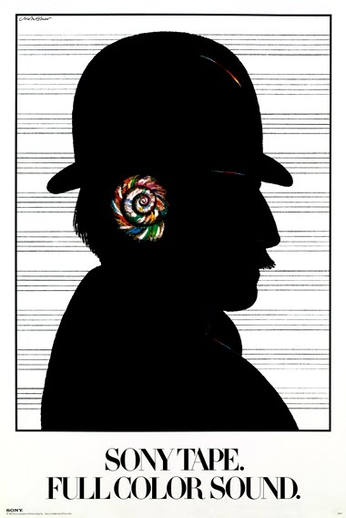
This was a wildly used image by Sony. A poster inspired by a brilliant headline: "Full Color Sound." "Sometimes words trigger the visual imagination in a powerful way" said Milton Glaser. The image owes a debt to Magritte, one of Milton Glaser's all time favorite sources of ideas.


The poster above was created by Milton Glaser. He wanted a poster that wasn't the usual rectangular shape, and by using the perspective of the grid created the appearance of 3D, as the product appears to be jumping out of the page towards you. He also liked to make his posters appear to have a folded over corner, to move away from the average rectangular poster. Only when studying the poster closely could you tell that it was only an optical illusion.


By the late 1960s his forms had become flatter and more brightly coloured, inspired by Pop and Op art (e.g. Mahalia Jackson poster, offset lithograph, 1967; New York, MOMA), and he also restyled a number of American and European journals in this more contemporary manner. He often created posters for musicians and concerts. Creating many memorable posters and album covers for many famous musicians, including Bob Dylan and Elvis Presley.


The above poster was made to promote New York Magazine, which was founded by Clay Felker and Milton Glaser in 1968.


Saratoga Performing Arts Center
A benevolent Satyr became the subject for a series of musical events.


Links

Irene - Frank Kozik 2


Frank Kozik

Frank Kozik creative career grew largely out of his enthusiasm forAustin's growing underground rock scene in the mid-eighties. Starting with black and white flyers for friends bands posted on telephone polls, his reputation grew as an artist who's work was graphically compelling as well as culturally gripping.

With hundreds of full-color, limited edition, silkscreened posters under his belt for such renowned artists as Nirvana, PearlJam, The Red Hot Chili Peppers and The Beastie Boys, he has also been the subject of many magazine articles such as Newsweek, Rolling Stone, Spin, and Details.

Not limited to the rock world, Frank has also done work for Nike, BASF, Slim Jim and MTV. His newest venture, http://www.fkozik.com/ , is an interactive site dedicated to creating a place for fans to go as well as purchase his art, both of which are firmly dedicated to producing the ultimate in collectible show posters and prints.


Frank Kozik was born in Madrid, Spain in 1962. At the age of 14, he moved to the United States and settled in Austin Texas.

Credited with single handedly reviving the "lost" art of the concert poster, Frank Kozik (American graphic artist) has worked with Nirvana, Pearl Jam, Stone Temple Pilots, the Red Hot Chili Peppers, Melvins and Butthole Surfers.

Kozik runs Man's Ruin Records, a media outlet and record label, and has published several books including Man's Ruin: Posters and Art by Frank Kozik, and Desperate Measures Empty Pleasures.
Kozik has been described as "one of the rock world's top poster artists", and interviewed in Rolling Stone.


Justine Barratt - Shigeo Fukuda


Poster Designer

Shigeo Fukuda, an influential Japanese graphic designer who was known for acerbic antiwar and environmental advocacy posters that distilled complex concepts into compelling images of logo-simplicity.


“Victory 1945,” a satirical poster by Shigeo Fukuda.

Mr. Fukuda was expert at communicating messages using minimal graphic means. Although he admired Japanese woodblock traditions, his spare style was universal, his symbolism bridging cultural divides.


Shigeo Fukuda was interested in illusionism, with illusionism he dramatically shatters all cultural and linguistic barriers with his universally recognizable style.


Although he had some commercial clients, most of his work was for social and cultural concerns, like the 1970 World’s Fair in Osaka, for which he designed the official poster.


In Japan, poster design is not as aggressively sales oriented as it is in the West; rather, it is a form of cultural communication and often a vehicle for advocacy on political and social issues. In 1980, for example, Mr. Fukuda designed a poster for Amnesty International showing a drawing of a clenched fist interwoven with barbed wire.


And yet, in work reminiscent of the pictorial illusionist M. C. Escher’s, Mr. Fukuda often used humor as a tool. Many of his best-known designs are visual puns that evoke double readings. One is a widely reproduced satirical poster, “Victory 1945,” showing an airborne black artillery shell aimed directly at the opening of the cannon barrel from which it was shot.


“I believe that in design, 30 percent dignity, 20 percent beauty and 50 percent absurdity are necessary,” he once told the Japanese design magazine Idea.


http://www.adcglobal.org/archive/hof/1987/?id=235

http://en.wikipedia.org/wiki/Shigeo_Fukuda

http://www.nytimes.com/2009/01/20/arts/design/20fukuda.html

Danni/VictorMoscaso


VICTOR MOSCOSO

Born in Spain, but grew up in Brooklyn, New York, Victor Moscoso was one of the most fascinating artists of the psychedelic era. The only academically trained artist among the leading poster designers, he relied on innovative optical effects that gave his psychedelic posters a unique "vibrative" quality.


Moscoso's fame rests on the brilliant series of posters that he did for Chet Helms and the "Family Dog" and the "Neon Rose" series that he created for the Matrix in the 1960's.

Because of his early interest in art, he attended Cooper Union before transferring to Yale. At Yale, Moscoso studied with the modern colorist Joseph Albers, whose color theories were an important influence on Moscoso and the development of the psychedelic poster.


Moscoso distilled the understanding of color relationships that he learned from Joseph Albers into his poster design work. He would create an optical effect in the viewer by alternating deeply saturated primary colors. The juxtaposition of colors would create the illusion of the poster moving back in forth in space.


Moscoso used more conventional typefaces than some of the other designers, usually letters with large serifs, but he bent and twisted them into interesting shapes that viewers had to strain to read.


Moscoso was also one of the main artists of the early American underground comix scene. Moscoso was one of the most important artists of Zap comix, the underground comic magazine started by Robert Crumb.


ShEpArD FaIrY: Obey Plagiaist _ Madii

Shepard Fairy: from humble beginnings as a defiant,
skateboard-obsessed art student,
he has developed into one of the most
influential street artists of our time.


Shepard Fairy, is the
mastermind behind the obscure
street posters, stickers and
stencils that combined the
words "Andre the giant has a
posse". With the visage of
deceased wrestling superstar,
Andre the Giant. By the early
1990’s the incomprehensible
images had become ubiquitous
in major urban centers around
the world, but in 1993 Titan
Sports, Inc.(now World Wrestling
Entertainment, Inc.)threatened to
sue Fairey for violating their
trademarked name, Andre the Giant.
Fairy responded to this threatening
lawsuit by altering the image of
Andre and incorporation the word
"obey" self-titled "absurdist propaganda"
campaign was born. http://obeygiant.com/


This poster widely described as
iconic, became synonymous with
the 2008 Obama presidential
campaign.The design was created
in one day and printed first as
a poster. Fairey sold 350 of the
posters on the street immediately
after printing them. It was then
more widely distributed—both as
a digital image and other
paraphernalia—during the 2008
election season,initially
independently but with the approval
of the official Obama campaign.
The image became one of the
most widely recognized symbols of
Obama's campaign message, spawning
many variations and imitations,
including some commissioned by
the Obama campaign.


Fairey is a street artist who

speaks out against the abuse

of power and militarism while

supporting people of color

and women who seek equity.

Given the recent erosion of

the United States’ moral

reputation and economic status

as a super power, the social

and political criticism of

Shepard Fairey’s street art

becomes more poignant.His

installation entitled

“Mujer Fatal” (2007) is a

blend of love, sensuality,

and police order. Wishful

thinking and reality are played

out in a conflicted political

arena where many nations resist

the domination of a super power.

They are caught in a dilemma

between envying and rejecting

the materialistic wealth of

contemporary America.

http://artwelove.com/artwork/-id/1ecc3394


Fairey’s “Obey” series stands

out as an example of the

authoritarian influence of

propaganda poster art. In

Benito Mussolini’s fascist

Italy (1922-43) the credo of

the Fascist party was

“believe, obey, fight” (

Credere, Obbedire, Combattere

in Italian). Fairey’s posters

combine elements of world

history, blending fascist

symbols with the communist

propaganda art of the former

Soviet Union, the People’s

Republic of China, Vietnam,

and the imperialistic goals

of modern Japan (1895-1945).

His poster art reminds viewers

of the 1960’s mythology of a

peaceful and bountiful life style

in America, which was envied by

some and despised by others less

fortunate. It takes time to digest

the contradictions of Fairey’s

sweet young girl in “War by Numbers

(2007). The girl is holding a hand

grenade topped with a bright red

rose. She smells the rose’s scent

while bombers fly overhead. The

juxtaposition of sniffing a rose

while holding a hand grenade is so

loud that the viewer can almost

hear the drone of the warplanes This

poster contains psychological tension

created by the conflicting images of

sight, smell, and sound. Fairey

successfully blends and bonds

contradictory elements in his posters.

http://obeygiant.com/shows/duality-of-humanity/war-by-numbers-mural

SAM - Jamie Reid


JAMIE REID

"The single most iconic image of the punk era"
- Sean O'Hagan (The Observer)

Born in 1952, Jamie Reid is a british artist, anachrist, situationist, and activist, the man who cut-and-pasted the punk movement of the late 1970's. Responsible for the Sex Pistols legendary "never mind the bollocks" artwork, Reid is the man who put a safety pin through Her Majesty's lower lip.
He took part in a sit-in at Croydon art school - where he met and befriended Malcolm Mclaren (manager of the Sex Pistols) and later on asked him to work on the Sex Pistols "God Save The Queen' artwork. Loved and loathed, he visionally epitomized the D.I.Y punk ethic with his own form of visual anarchy.
Reid's stint as the Sex Pistols art director would result in the most provocative designs in rock music. His work demonstrated the power of graphic design in the music industry and opened a door to a strong new generation of British designers.
He has also done poster campaigns for Anti-poll tax and Anti-Criminal Justice Act.
In 1989 a Tokyo Gallery asked Reid to do a retrospective "Peace is Tough" the exhibit lasted for a strong 10 years.
Today he is involved with the Strongroom Recording Studios based in London.


http://www.mital-u.ch/PunkWave/j_reid.html
http://en.wikipedia.org/wiki/Jamie_Reid
http://www.mital-u.ch/Dada/situe.html#SI
http://jamiereid.org/
http://punkflyer.com/jamiereidartwork.html


Michelle - Massimo Vignelli Posters

Typeface Exhibition Poster
New York, 1991


For Massimo Vignelli, poster design is mostly impact and the organisation of the information to sustain the impact.

"Most of the posters that we design are institutional rather than commercial. Therefore, they are more informational oriented than persuasion oriented."
Vignelli Associates


Knoll International, 1966
Known for its contemporary classic furniture, Massimo played with the name of this well-known company, and on the back of the poster used line drawings to illustrate the furniture collection.


Institute for Architecture and Urban Studies, New York, 1979-1980
Projecting the Institute's identity as strongly as the poster’s content, as a means of enforcing and emphasizing the Institute’s dynamic role. With the audience being primarily architects, this would be perceived and retained appropriately.


Fort Worth Art Museum Graphic Program, 1976
A simple format, a black band at the top for the museum identification, an information band for the events and a band for the illustration.


Bicentennial Poster USA, 1976
This poster celebrates the lively interaction of the various ethnic groups that make up the USA.
As part of a series for the United States Bicentennial, this poster was commissioned to celebrate the "melting pot" in American society.
Massimo bought all the foreign-language newspapers published in New York, and with them he made an American flag.
Everybody liked it in Washington D.C., except one bureaucrat from the Pentagon who called Massimo to ask if he could do another one with better news. He refused their request, and they refused to print it. It still hangs in Massimo's office as a symbol of the melting pot.


European Iceberg Toronto, 1984
For an exhibition of work by artists from Europe, the poster was designed to hang vertically or horizontally. It featured the colours of many European flags to signify the nationality of the artists.


LINKS