Monday, March 7, 2011

STACY POST 4: Poster Design


Select another designer from the list below or use one of your existing designers then discuss their contribution to poster design. As usual post 200 wds, 5 selected images and 5 hyperlinks.

Jan Lenica
Martin Sharp
Tim Biskup LUCA
Abram Games
René Gruau
David Hockney
Frank Kozik IRENE
Shag
Victor Moscoso DANNI
Reg Mombassa
Aubrey Beardsley
Roman Cieslewicz
Shigeo Fukuda
Alfons Mucha JUSTINE
Masuteru Aoba
Ikko Tanaka
Rick Griffen
Jamie Reid SAM
Shepard Fairy MADDI

Sunday, March 6, 2011

April Greiman - Kate Hemensley


'Design must seduce, shape, and perhaps
more importantly, evoke emotional response"


April Greiman is regarded as a bridge between the modern and postmodern, the analog and the digital. She is a thinker and artist, whose transmedia projects and hybrid-based approach has been influential worldwide over the last 30 years. Her explorations of image, word and color as objects in time and space are grounded in her singular fusion of art and technology. Greiman has been instrumental in the acceptance and use of advanced technology in the arts and the design process since the early 1980s. In 1984 she bought her first Macintosh.


Greiman born in New York City and studied at the Allgemeine Kuntsgewerbeschule (General Arts Trade School) in Basel, Switzerland and the Kansas City Art Institute. She moved from New York to Los Angeles in 1976, establishing her multi-disciplinary practice, currently called Made in Space.

Snow white + the seven pixels. 1986


Her willingness to exploit serendipity is central to her success. There isn't much in her field that she hasn't tackled. She has designed everything from cracker packages and corporate logos to TV commercials. For one Los Angeles restaurant, she designed not only the interior but the menus, the wine list, the matchbook covers, and even the sign out front. She has also produced many objects and images that appear in the built environment. Frequently collaborating with architects. Recently the City of Los Angeles chose her firm to help revamp deteriorating Hollywood Boulevard.


Nicola Restaurant and Kiosks, Los Angeles, California


Cerritos Performing Arts Centre


Links:
artscapemedia.com
aprilgreiman.com
madeinspace.la
artdirectory.info
creattica.com

Friday, March 4, 2011

Shane_OLIVIERO TOSCANI_Words of Wizdom pt.3


BANNED!!!

No one, for sure, can deny Toscani's ability to grab your attention. Shocking is again how many are describing his latest creation, a billboard and newspaper campaign for an Italian clothing line that features a stark photograph of a naked anorexic woman. On Friday, the image was summarily banned by Italy's advertising watchdog, citing infringements on the organization's code of conduct for exploiting an illness for publicity purposes. Toscani told Italian newspaper Corriere della Sera that he would sue for damages. On a recent afternoon at his office outside of Pisa, before the ban was announced, he was still absorbing the initial outrage that had ensued, from both fashion executives and those suffering from an eating disorder. Dressed in jeans and a blue checkered shirt, Toscani is a big man with a square jaw who doesn't sit still, something of an even more hyper Jack Nicholson. He neither casts off nor takes too seriously the criticisms, including the accusation that the outcry is exactly what he's aiming for. "Sure, you want to get people's attention. This is communication," he says. "But I still can't understand why people are shocked by something that obviously exists. It's like in a family that always avoids talking about its real problems."


http://en.wikipedia.org/wiki/Oliviero_Toscani
http://www.olivierotoscanistudio.com/
http://edition.cnn.com/2010/WORLD/europe/08/13/oliviero.toscani/index.html

http://www.toscani.com/
http://www.time.com/time/arts/article/0,8599,1673663,00.html


Wednesday, March 2, 2011

Shane_OLIVIERO TOSCANI_Words of Wizdom pt.2


O
liviero Toscani (born 1942) is an Italian photographer, best-known worldwide for designing controversial advertising campaigns for Italian brand Benetton, from 1982 to 2000. Most of these advertising campaigns were actually institutionals for the brand, always composed of rather controversial photography, usually with only the company logo "United Colors of Benetton" as caption.
His great breakthrough, though, can be traced to 1991, when he simply slapped the green Benetton logo on a photojournalist's award-winning image of a dying AIDS patient surrounded by his family. Since then, the son of a renowned Milan photojournalist has snapped his own striking frames of Balkan war victims, children from a Sicilian Mafia town and death-row inmates, the last of which set off widespread anger in the United States and eventually lead to his split with Benetton.

Tibor Kalman logos (Luca De Michele)

One of the most famous logo all over the world
that Tibor Kalman did is the one for “Colors”.
Italian Luciano Benetton and OlivieroToscani founded this magazine in 1991;purpose of it was the expression through image.
Was sold in 40 countries in 4 languages. Two particular publications attracted the world public: issue number 4 and issue number 7.


Issue number 4 was released in 1993, covering
the topic of race and created an international
outcry by the controversial and “sexy” picture.

Issue number 7 was released in 1994 covering the AIDS manner in a straightforward way, something that other form of media had been willing to do until that time.
Speaking about culture, abortion, race, AIDS, Colors became important all over the world.


Tibor also design two covers for the band “Talking heads” (from the
albums –Remain in light- and –Naked-)


Milton Glaser (Luca De Michele)

Milton Glaser born in June 1926 in New York.

He frequented the High school of music and art in New York and through a scholarship the academy of fine art in Bologna, Italy.

"Push Pin" is a studio started in 1954 formed by Glaser and many his classmates after school. Characteristic of this studio is the design of the "passè" (past style), while it, introduced with a contemporaney design including books, records covers, posters and logos.

While he was in the studio, he also founded with Clay Felker the “NY magazine” in 1968. As Glaser left Pin Studio, in 1974, he create “Milton Glaser INC”. He is famous for creating the logo “I love NY”, for the department of commence in New York in 1973.

He has designed and illustrated more than 300 posters like: for CBS records, a poster with the face of Bob Dylan in 1966 (for music industry), poster for the Aspen Winternational (for sport industry) in 1986, for “TABA”, the celebration of American books (for books industry) in 1980, “image of “Labor” (for political industry).
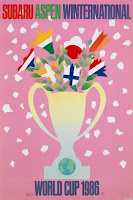
In 1983 with Walter Bernard founded the company WBMG, a studio dedicated to magazine and newspapers design work.

From the starting of his career, Glaser has been a member of education communities and he taught at the school of visual art in NY.

For him, drawing is always been the fundamental way of looking thing. Describe drawing like a way of encountering reality.

“First we have to learn to draw accurately, then we can express ourselves” he sad.

The biggest challenge, he sad, is not getting bored or disinterested in what you are doing and maintain your personal vision and sense of appropriateness.


Tuesday, March 1, 2011

Mike Svoboda

Milton Glaser
5 Logo designs


The DC Bullet comic book graphic was used from 1977-2005, actually created by Glaser in 1976. However in 2005 its since been replaced by the "DC" letters against a saturn-like ring in a dimensional rendering


I LOVE NY designed for the New York State Department Of
Commerce in 1973. A tourist campaign symbol that became
the most frequently imitated logo design in human history.
Glaser was in the back of a yellow taxi in Manhattan when he
experienced the "EUREKA" moment that would define his life.
He pulled a red crayon from his pocket, began to sketch on the
back of an envelope: First an "I" then the simple outline of a
heart, followed by two letters "N" and "Y".


Windows On The World
A Restaurant on the 10th floor of the World Trade
Center. He designed ever aspect.


In 1987 it began with the logo itself which was intended
to produce a reference to the old Brooklyn Dodgers
a baseball team, before they decamped for Los Angeles


Milton was responsible for the graphic design,
theming, and signage for Franklin Mills. A
retail mall in Philadelphia (1986-89).


Links:
http://rogallery.com/Glaser_Milton/Glaser-bio.htm
http://retinart.net/graphic-design/newyorkmag/
http://www.designboom.com/eng/interview/glaser.html
http://www.absolutearts.com/cgi-bin/news/arts-news-elaborate.cgi?output_number=20&find=2440
www.miltonglaser.com